“A paper stock can make or break a design”

Interview with Rowena Curlewis, CEO of Denomination, Australia.

Denomination have recently designed the wine labelling for Farm Hand, by Fourth Wave Wines, and have shared with us the creative process from concept to shelf.


What was the design brief?

Our client was keen to create an organic wine brand that would give consumers a more natural product. With minimal preservatives and no animal products used to fine the wine, this brand would use only organic fruit. The resulting brief was to clearly communicate its natural and organic nature, as well as to communicate the handmade, boutique nature of the brand.


How did you approach achieving the design brief?

The first part of the project was to create a name that would embody the natural, handmade nature of the wine. The name “Farm Hand” was inspired by one of the growers whose organic farming philosophy extended beyond the vineyard to the rest of the farm. Farm Hand also spoke to the simple, pared back nature of the brand and its products.

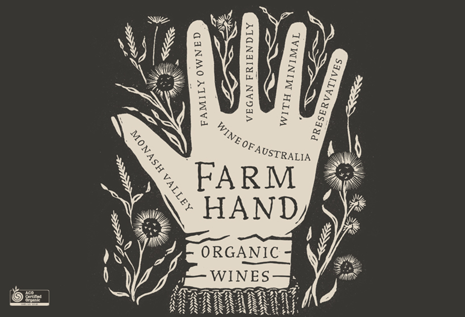
The design features a specially commissioned naïve illustration of a hand interwoven with farm produce. Hand-drawn typography for the Farm Hand logotype complements the naïve illustration style. Each finger of the hand contains the natural features of the wine.

A simple colour palette of black and cream was chosen to communicate the brand’s premiumness but also complement the pared back nature of the brand’s personality.
 

How did Avery Dennison materials help you to achieve your vision?

When it came to choosing a paper stock, we wanted a stock that had a lovely matte feel, and that would hold a heavy dose of black ink evenly. Estate 8 has great results in terms of printability but also it has excellent performance in the fridge so can work well on both red and white wines.


What was the end impact of the design?

Farm Hand has only just been released to the market. The lead retailer in Australia chose the brand immediately as its choice as lead brand in the emerging organics category.


When you receive a design brief—or design challenge—what is the first thing that you think of or do?

Think hard about the challenge facing the brand, and then try to think of ways to solve these in an unexpected way.


Do you ever get a creative block? If yes what do you do to overcome it?

Yes of course, all designers get creative block! Ways to overcome it vary but we recommend to our designers to go and do something else to give their brain something else to think about it, and usually an idea will spark as a result. Or alternately, go see the world – visit an art gallery, a book store, a café, a bar, theatre or any other source of inspiration. Ideas can be inspired from sometimes random events or objects. If all else fails, have a glass of wine!


How important are materials to you in your design process?

Extremely important: a paper stock can make or break a design. A poorly selected stock that has the wrong tones for the colour palette or does not suit particular imagery, can really destroy an otherwise great design. Materials can also inspire a design solution, for example Avery Dennison’s Tyvek 54 recently inspired a new design concept that we are hoping will go through for a high end luxury Pinot Noir.


Do you select the material yourself—or is it normally specified for you?

No we always select the stock ourselves, although we often need to work within our client’s production constraints. Some of our larger clients have a smaller selection of paper stocks that we can chose from.


Do you ever design around any material challenges?

Yes sometimes if we need to use a certain stock because it performs well in ice bucket tests, but it may not have the right tone of white, we will get the printers to tint the sealing varnish to warm up an otherwise cool toned stock.


To learn more about Denomination please visit : 
www.denomination.design