“Paper is my Canvas”

Interview with Jordan Jelev, from The Labelmaker.

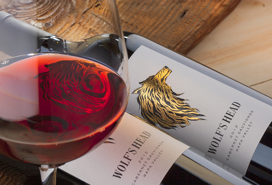
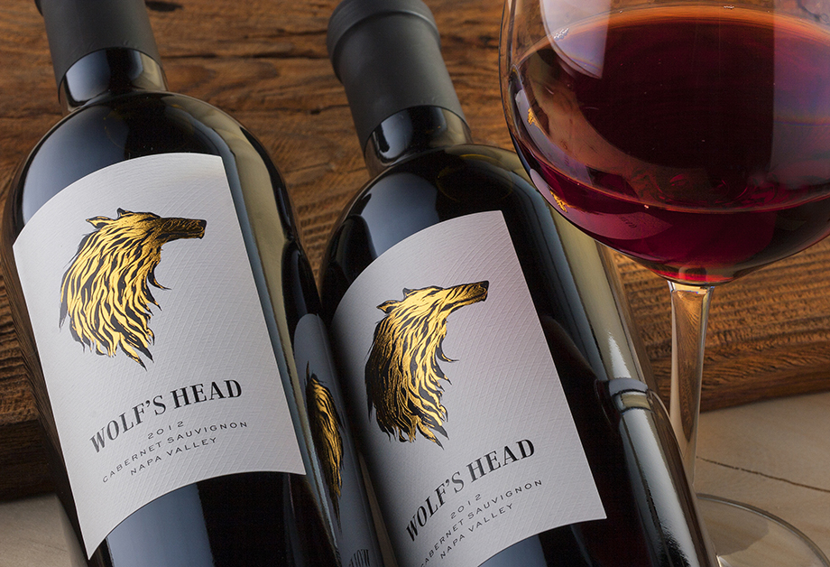
Jordan has recently designed the wine labelling for a new winery in California—Wolf’s Head Vineyards.


What was the design brief?

Everything was surprisingly clear to me from the beginning till the very end of this project. One day I received an email from Cameron Woodbridge, Winemaker at Wolf’s Head Vineyards, expressing interest to contact me and the next day I got the story of the winery. He explained how the satellite picture of the vineyards reminds him of a wolf’s head. That’s how the winery was named.

So the brief was very simple and short—“I want a wine label with Wolf’s head on it”.

Cameron also commented that he liked one of my previous wine label designs very much—the one called Salla White.

I already had my vision and when I requested the satellite pictures from Cameron it was even more clear to me.


How did you approach achieving the design brief?

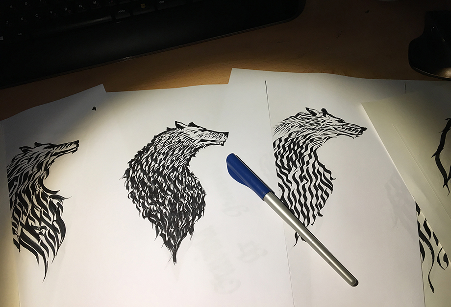
It was evident that the illustration of a wolf’s head should be the most significant part in my design. I did my own research for wolf’s anatomy and especially for heads because I had never drawn a wolf before in my whole life. I took my favorite Pilot Parallel pen with black ink and spent 2 or 3 days drawing different wolf heads. The final image did not came easy because I made the chest a little bit larger than necessary so I had to edit my illustration several times before reaching the final image.

After the illustration was done the rest of the design happened really quickly. I had to think about composition, typography, paper and print and it was really fun when you have the wolf’s head done already.


How did Avery Dennison materials help you to achieve your vision?

I picked Fasson Bright White Felt as my material because I wanted strong presence of the paper for this design. The label is quite clean so the visual impact from the  wolf’s head image and the paper were the two very important effects I was looking for. Another great advantage of this paper was the texture—I really don’t know exactly how it happened, you see these things after the label is printed, but the paper texture somehow became part of my wolf adding more tiny hidden details that made the whole image look more organic. This is very visible in the areas where the gold foil is stamped.


What was the end impact of the design?

Packaging of the world featured the label almost instantly after it appeared on the Labelmaker’s web site. It was amazingly well-received across social medias too and it helped me also get some new clients who saw the label and then contacted me for creating their own!


How long have you been designing—and what matters to you in terms of materials?

I started designing wine labels in 1998. Since that time I am fully focused on wine and spirits industry. I have always said that printers and papers are the true foundation of my work. They visualize my artwork and make it live. This is essential for the whole process where everything matters. So as you see design is not everything. Knowing and understanding the process as a whole gives you the chance to improve your labels and make them better and better. The more you know about materials and their use the better your work is.

I pay a lot of attention to every detail but above all I try to start every new design with my paper choice. Paper is my canvas. First I start with its appearance and weight. They must fit my design. The finish of the paper is very important when you make the design and print after that—matt or glossy papers have different performance when covered with inks and you actually think and do all at once in your mind. The process of creating, design a label is one thing with the process of printing. You must know and align these two processes to make a stellar label.

Adhesion is another extremely important technical parameter of the paper especially when we speak about low temperatures, chilling and ice bucket.

As you know I do all wine photos by myself. Being pro photographer makes me see different things in my studio. Controlled light conditions often change the structure appearance of the paper dramatically. It is important to know how to manipulate light so that you could get the best of your label—stunning paper, sharp details, shining hot foils, sensitive embossing. Another great trick when you chose a paper is to know its transparency level when exposed to strong backlight. Most of the white wines are photographed with backlight and in cases like this you must pick a less translucent paper otherwise the backlight will go thru the paper and will change dramatically your label appearance on the bottle.

So as you see there are many details that might turn into obstacles in your creative process. For me the solution is to play very carefully with the materials used for the label and to know as much as possible for each of the processes involved in label production.
 

When you receive a design brief—or design challenge—what is the first thing that you think of or do?

I have a lot of experience and I usually try to see in my thoughts something very close to the final result. It is a special feeling and I am not sure I can describe it. No matter if I read the bried in email or I discuss it in live conversation I receive almost clear vision of what should happen almost instantly. This is a great advantage I believe because it gives you freedom to sophisticate the future artwork in your fantasies even before getting started with the white sheet and the pencil.


Do you ever get a creative block? If yes what do you do to overcome it?

Of course I do. Everyone does—we are not machines. I don’t have special cure for this—it is different every time. I try to stay relaxed, change my point of view, try to go deeper in understanding what I should do… it’s kind of meditation and gives good results for me every time I practice it.


How important are materials to you in your design process?

They are essential. They go hand in hand with my creativity. My idea is always weld with materials—paper, bottle, sealing, hot foil, varnish, embossing, label shape…. they are all first line instruments for my idea.


Do you select the material yourself—or is it normally specified for you?

I always select it myself. It doesn’t mean of course I don’t discuss it with my clients, printers, paper producers etc. I also try always to keep myself up-to-date with latest innovations in industry so that I could get the best of what is new.


Does the material choice impact the design itself?

Of course it does—as I said above, they are one thing like the painting and the canvas and even more. Wrong paper choice could ruin your work. And I mean not only paper—it is about everything. A small universe we must keep in balance and harmony.


Do you ever design around any material challenges?

I love to play with materials in my designs. Understanding the finish of the paper allows you to use it properly and even change it and customize it for your own need. I often do this and I believe this is one my personal marks in my work that make my wine labels look different from the rest on the shelf. Labels like SOULMATEs, ERELIA, Gaetan, Glarus Signature as well as White Story and Think Pink Rose are true examples for what I do.


If you could innovate any material what would it be?

For me the greatest innovation at the moment would be to be able to easily customize papers in the factory and then use them for the print. I also like the expanding trend of using different materials like wood, textile, metal etc.