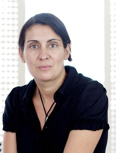
Francisca Martín, founder and creative director, from design agency Ruska Martin Associates, says that we usually make decisions for or against a particular design intuitively: “To make a good choice, we have to feel how the consumer feels, or give the consumer something to feel that he has never felt before. The restrictions imposed by 90 square centimetres of design area are actually a kind of benefit, because a wine label should be like a gallery. There is a fixed boundary, and within that boundary something must be exhibited. It’s as simple, and as complicated, as that.”
The wine market is one of the most competitive markets ever. Martín says that finding a unique position is an art, not least because around four-fifths of consumers are ‘label buyers’: “Surveys among wine drinkers in the US, as an example, show that around a quarter of them simply feel overwhelmed by the variety of products on offer. In case of doubt, these people decide whether a label appeals to them.”
The market is also very large. More than 50,000 wine brands are actively promoted in Germany. An estimated 26,000 new products of various types flood the market every year. Even a standard supermarket can have 400-800 varieties – a level of variety not found in any other product group. In their search for the perfect formula, winegrowers experiment with different glass thicknesses, bottle shapes and colours – and with labels using different paper qualities, materials and haptics.
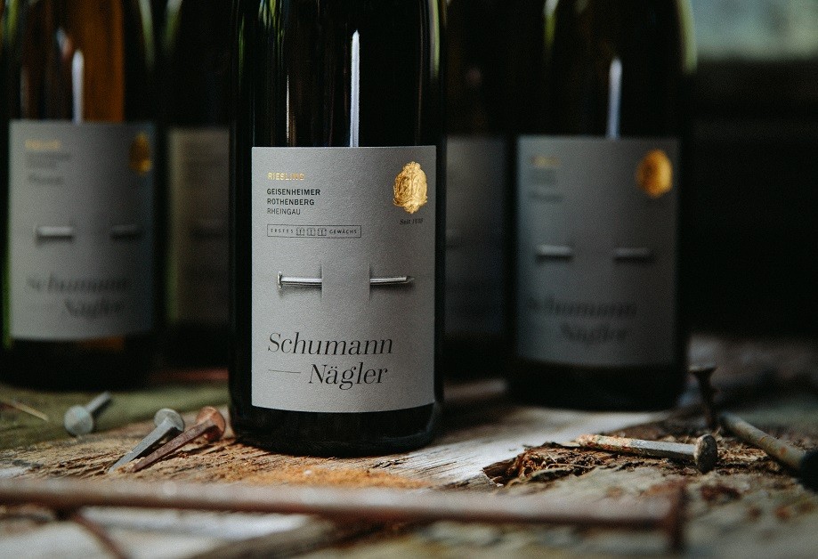
Martín says that the wine label is a business card, but also much more: “The label has important information for the connoisseur, but this information says very little to the amateur or simple wine lover. That’s why a well-made label must also have spirit. It is not just ‘decoration’, because it has to show the soul of wine, and the people behind it with their care, their talent, and their work. A well-made label must also last ten, or even 20 years. It may be an important investment for a client.”
